There are many different ways you can plot data using Python. One way is to use matplotlib
Chapter 5.2.1 - Bar plots
If the data are meant to be binned (grouped) instead of continuous, it may be useful to use bar plots instead of line graphs.
Bar plots are created in a very similar way to line plots. Let’s compare two examples.
Line plot, like in section 5.1:
import numpy as np
import matplotlib.pyplot as plt

x = np.array([1, 2, 3, 4, 5])
y = np.array([10, 20, 30, 40, 50])

plt.plot(x, y)

plt.grid()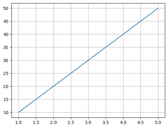
Bar plot, using the same data, just changing the method name from
plottobar:
x = np.array([1, 2, 3, 4, 5])
y = np.array([10, 20, 30, 40, 50])

plt.bar(x, y)

plt.grid()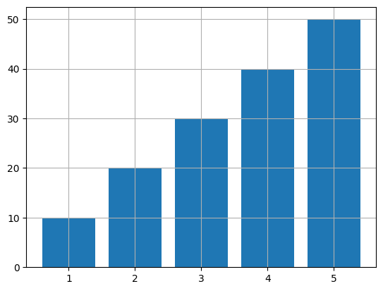
Notice that the data are exactly the same, the only difference is the method used to plot the data.
For basic plots, the “plug and play” nature of matplotlib makes it attractive for exploratory analyses. If you do not like a plot, just find a new plot type, and keep everything the same except for the method name.
Chapter 5.2.1. Example: plotting mean temperatures per month
When approaching a new problem with a new dataset, you need to figure out how to translate what you want into Python code.
For example, if you have a list of monthly precipitation for one location, what are some important things you should consider?
What is the independent variable: In this example, month is the independent variable, as it controls the variability you see in weather observations for a location.
What is the dependent variable: In this example, temperature is the dependent variable, as it will vary / change depending on the month.
Next, some practical considerations for converting the independent and dependent variables into Python code:
How can I use previous examples to simplify my life by “plugging in” the new values. You can use both Python and “real world” examples.
What data type should I use for month and temperature?
Can I take advantage of any iterators to simplify creating data?
What length should each list be (i.e., how many month and temperature pairs?)
#1 is potentially the most important. This is because it is much easier to modify an existing example than starting your own solution from scratch.
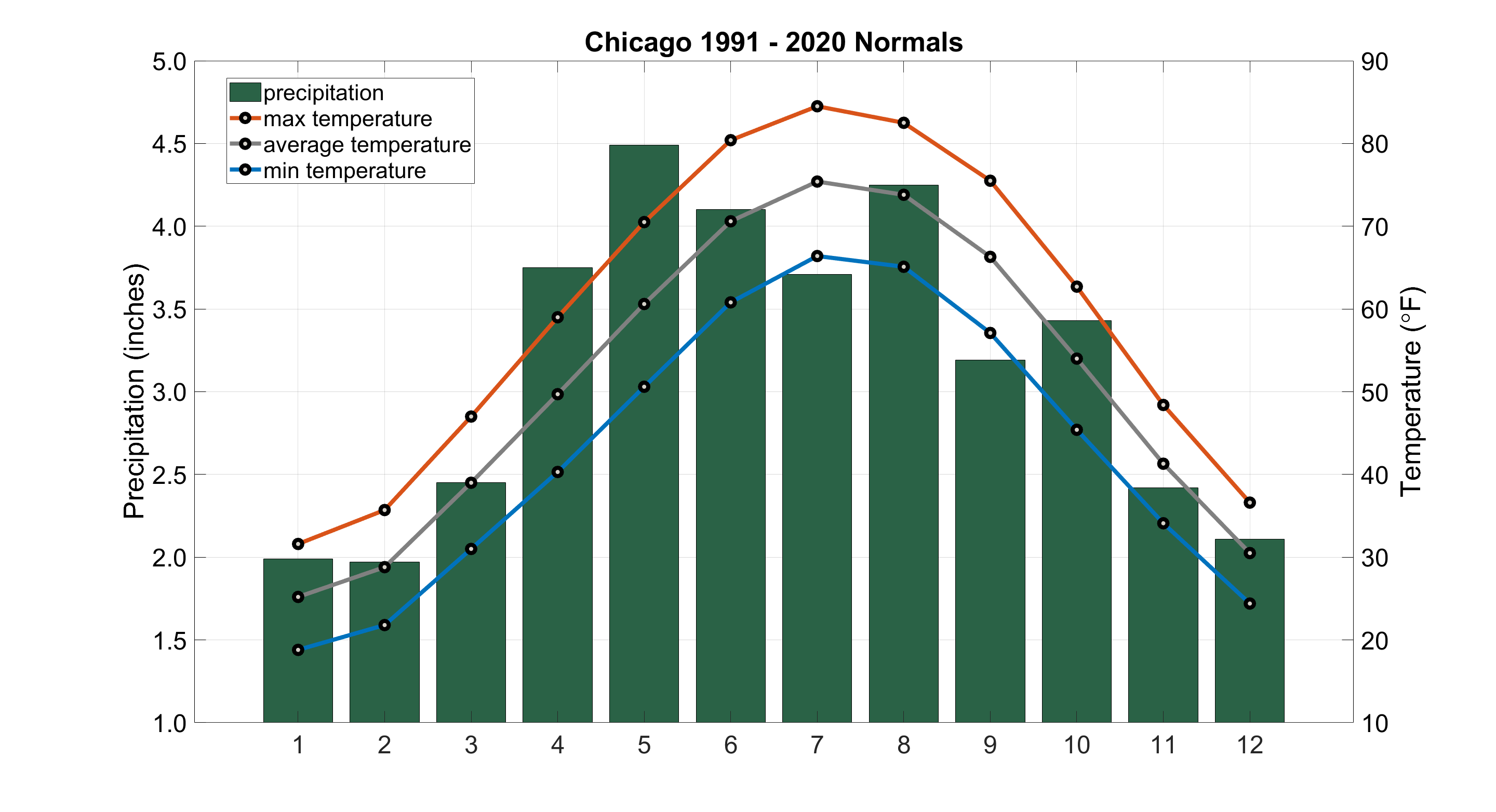
The first thing you should do is sketch out the idea on paper or in your head. In other words, what does a graph of monthly temperatures look like? To answer our question, we could search google for “monthly temperatures”. Some of the first results are very nice visualizations. One example is from the Illinois State Climatologist’s office.
What do you notice about the graph:
What is the title? Chicago 1991 - 2020 Normals
How many observations are there? 12
What is the x-axis range? 1 - 12
What are the y-axis values (Approximate)? ```2.0, 2.0, 2.45, 3.75, 4.5, 4.1, 3.6, 4.25, 3.2, 3.45, 2.4, 2.1``
What are the variables for each axis? x-axis is unnamed, but appears to be month number (1 = Jan, etc.) and y-axis is Precipitation in inches.
What type of graph is used? Both a bar plot and line plot are used.
We can take all of that information and turn it into Python code!
import numpy as np
import matplotlib.pyplot as plt

## What is the title? Chicago 1991 - 2020 Normals
plt.title("Chicago 1991 - 2020 Normals")

## What is the x-axis range? ```1 - 12```
month = np.array([1, 2, 3, 4, 5, 6, 7, 8, 9, 10, 11, 12]) # could also use range(1, 13)

## What are the y-axis values? ```2.0, 2.0, 2.45, 3.75, 4.5, 4.1, 3.6, 4.25, 3.2, 3.45, 2.4, 2.1``
precipitation = np.array([2.0, 2.0, 2.45, 3.75, 4.5, 4.1, 3.6, 4.25, 3.2, 3.45, 2.4, 2.1])

## x-axis is unnamed, but appears to be month number (1 = Jan, etc.)
plt.xlabel("Month")

## y-axis is Precipitation in inches.
plt.ylabel("Precipitation (inches)")

## what is the independent (x) variable? month
## what is the dependent (y) variable? precipitation
plt.bar(month, precipitation)

plt.grid()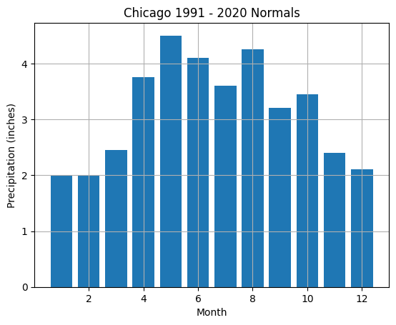
Not too bad! What are some easy things we can add to the plot to match the example?
Match the bar color (green)
Visualize more months on the x-axis (by default, matplotlib truncates the x-axis labels to save space)
Visualize more precipitation levels on the y-axis (by default, matplotlib truncates the y-axis labels to save space)
## What is the title? Chicago 1991 - 2020 Normals
plt.title("Chicago 1991 - 2020 Normals")

## What is the x-axis range? ```1 - 12```
month = np.array([1, 2, 3, 4, 5, 6, 7, 8, 9, 10, 11, 12]) # could also use range(1, 13)

## What are the y-axis values? ```2.0, 2.0, 2.45, 3.75, 4.5, 4.1, 3.6, 4.25, 3.2, 3.45, 2.4, 2.1``
precipitation = np.array([2.0, 2.0, 2.45, 3.75, 4.5, 4.1, 3.6, 4.25, 3.2, 3.45, 2.4, 2.1])

## x-axis is unnamed, but appears to be month number (1 = Jan, etc.)
plt.xlabel("Month")

## y-axis is Precipitation in inches.
plt.ylabel("Precipitation (inches)")

## what is the independent (x) variable? month
## what is the dependent (y) variable? precipitation
## Match the bar color (green)
plt.bar(month, precipitation, color='darkgreen')

## Visualize more months on the x-axis (by default, matplotlib truncates the x-axis labels to save space)
## The xticks function manually sets the "x-ticks" and labels
plt.xticks(month)

## Visualize more precipitation levels on the y-axis (by default, matplotlib truncates the y-axis labels to save space)
## the yticks function manually sets the "y-ticks" and labels
## Why do we not want to pass in the precipitation variable to this method?
##Instead define a new variable that contains the levels
levels = np.array(list(range(1, 10))) / 2 # how /why does this work and what is the result?
plt.yticks(levels)

plt.grid()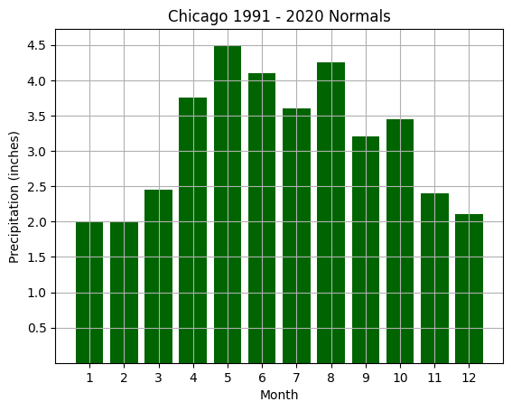
What are some more complex things we can do to match the example?
Add a variable for min temperature, average temperature, and max temperature
Add a 2nd y-axis to the right side to describe temperature
Add a legend to communicate to the reader what each graph item represents
We can add these items like this.
Chapter 5.2.3 - Multi-plot and multi-axes graphs
To accomplish the tasks above, we need to use a multi-axis approach to have two different y-axes.
I will explain the code in detail in this markdown, and then provide a working example in the following code block
We have to define two axes for precipitation and temperature, since the range of values is very different (19 - 83 vs. 0 - 5). The first step is to use the plt.subplots() method to give us the ability to customize the way matplotlib displays our data. This method provides us access to the “low level” subplot “class”, which we name ax below.
plt, ax = plt.subplots()Once we do this step, we can use both plt and ax to call our methods, but ax (and others you name, like ax2, ax3, etc., is used for a specific axis. plt.plot for example, is just fine for plotting an independent and dependent variable, or multiple variables that share the same y-axis number range (e.g., min, max, and average temperature). In this case, we will have two axes right on top of eachother, so you want to specifically plot to either ax or the other axis we will create below. NOTE: You can have multiple “Brady Bunch” axes as well that are adjacent to one other, but we will not be doing that in this example. sharing the same x-axis.
To create a second ax (a subplot) that shares the x-axis with ax, we will use the ax.twinx() method. In this case, we will call the second subplot ax2 and use it for all temperature data. ax will be used for precipitation data only. Moving forward, it is important to be specific as to which subplot you want to plot your data on (i.e., either ax or ax2).
ax2 = ax.twinx()We can still use plt for “global” items like title and shared axes:
plt.title("Chicago 1991 - 2020 Normals")
plt.xlabel("Month")
plt.xticks(month)
All existing variables stay the same
month = np.array([1, 2, 3, 4, 5, 6, 7, 8, 9, 10, 11, 12]) # could also use range(1, 13)
precipitation = np.array([2.0, 2.0, 2.45, 3.75, 4.5, 4.1, 3.6, 4.25, 3.2, 3.45, 2.4, 2.1])
We need to add data for min, max, and average temperature
min_temp = np.array([19, 21, 32, 40, 50, 60, 67, 63, 58, 47, 32, 23])
max_temp = np.array([32, 37, 48, 59, 70, 80, 83, 81, 76, 62, 49, 38])
ave_temp = (min_temp + max_temp) / 2 # how / why does this work? What is the output?
The y-axis code does need to change and is specific to ax and ax2. In general, the plot customization methods in plt vs ax have the same names, except they add ``set_to the beginning (e.g.,set_ylabelvs.ylabel). Most plotting functions (plot, bar```, etc.) stay the same.
The y-axis for ax is Precipitation in inches:
ax.set_ylabel("Precipitation (inches)")The y-axis for ax2 is Temperature (F):
ax2.set_ylabel("Temperature (F)")For the bars (precipitation data), we just have to change plt to ax. This plots the bar graph on the subplot ax. We added a new parameter named “label” to populate the new legend we will generate later:
ax.bar(month, precipitation, color='darkgreen', label='Precipitation')For the line graphs, we need to plot these on the second subplot named ax2:
ax2.plot(month, min_temp, color='blue', label="min temperature")
ax2.plot(month, max_temp, color='blue', label="max temperature")
ax2.plot(month, ave_temp, color='grey', label="average temperature")
Set the y-ticks like before, just with the axis name replacing plt and adding “set_” to the beginning of the method call
prec_levels = np.array(list(range(1, 10))) / 2
plt.set_yticks(prec_levels)
We create new levels for the y-axis ticks on ax2:
temp_levels = np.array(list(range(10, 100, 10)) # what is the output?
plt.set_yticks(temp_levels)
Finally, plot the grid on top of the data:
plt.grid()import matplotlib.pyplot as plt
plt.rcParams['figure.figsize'] = 10, 10
# set up subplots
fig, ax = plt.subplots()
# set "global" properties
plt.title("Chicago 1991 - 2020 Normals")
plt.xlabel("Month")
plt.xticks(month)
# create a new subplot that shares x-axis with ax
ax2 = ax.twinx()
# keep existing variables the same
month = np.array([1, 2, 3, 4, 5, 6, 7, 8, 9, 10, 11, 12]) # could also use range(1, 13)
precipitation = np.array([2.0, 2.0, 2.45, 3.75, 4.5, 4.1, 3.6, 4.25, 3.2, 3.45, 2.4, 2.1])
# add new temperature variables
min_temp = np.array([19, 21, 32, 40, 50, 60, 67, 63, 58, 47, 32, 23])
max_temp = np.array([32, 37, 48, 59, 70, 80, 83, 81, 76, 62, 49, 38])
ave_temp = (min_temp + max_temp) / 2 # how / why does this work? What is the output?
# customize y-axis labels based on what suplot you are using
ax.set_ylabel("Precipitation (inches)")
ax2.set_ylabel("Temperature (F)")
# plot the original bar chart on ax
ax.bar(month, precipitation, color='darkgreen', label='Precipitation')
# plot the line graphs on ax2
ax2.plot(month, min_temp, color='blue', label="min temperature")
ax2.plot(month, max_temp, color='blue', label="max temperature")
ax2.plot(month, ave_temp, color='grey', label="average temperature")
# set the precipitation y-tick levels on ax
prec_levels = np.array(list(range(1, 10))) / 2
ax.set_yticks(prec_levels)
# set the temperature x-tick levels on ax2
temp_levels = np.array(list(range(10, 100, 10))) # what is the output?
ax2.set_yticks(temp_levels)
# use the legend method to show a legend
plt.legend()
plt.grid()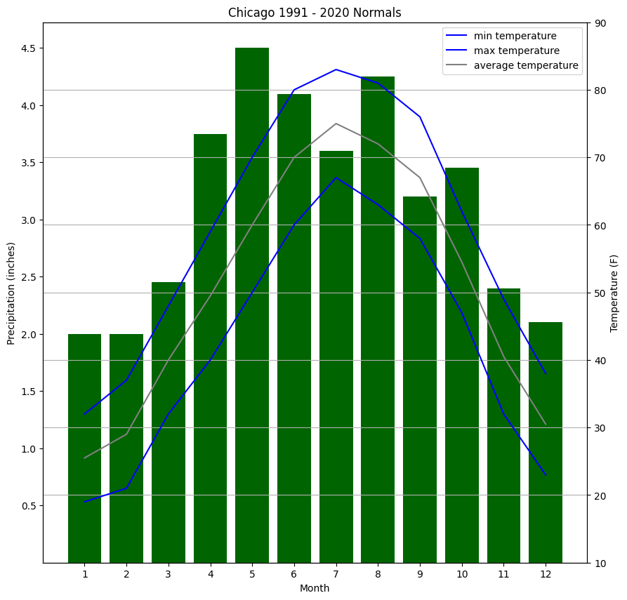
Chapter 5.2.4 - Try it yourself
Make a line plot that goes through the following (x, y) points
(0, 5), (1, 4), (2, 3), (3, 2), (4, 1), (5, 0)# Your code hereMake a scatter plot with the following (x, y) points and values/colors
(0, 5) has a value of 10, (1, 4) has a value of 5, (2, 3) has a value of 4
(3, 2) has a value of 3, (4, 1) has a value of 2, (5, 0) has a value of 1
Add a colorbar legend.
# your code hereLook up the wikipedia entry for Dallas (Dallas). Go down to the “climate” section. You will see a variation of a bar graph (“Climate chart”) that shows average high and average low temperatures for each month. For example, the January average high is 58 and the average low is 38. Plot the exact same bar chart from earlier in this file, except for Dallas.
# your code herePlot a line that corresponds to the equation y = x^2 for x values between 0 and 10. Use numpy to do your calculation.
# your code herePlot a line that corresponds to the equation y = sqrt(x) for x values between 0 and 10. Use numpy to do your calculation.
# your code here