There are many different ways you can plot data using Python. One way is to use matplotlib.
matplotlib provides a simplified user interface to complex graphic methods. Our exploration of Python functions and recently Python classes, properties, methods and importing give us all of the practice that we need to be ready to use matplotlib. There are many different types of plots you can create.
The basic interface is used in a Python program like this:
Import the plotting interface named
pyplotfrommatplotlib. Define its alias asplt
import matplotlib.pyplot as pltUse “dot notation” to access the different types of plots. For example, a simple line graph can be created using the
plotfunction:
plt.plot(....) # your method parameters go inside the parenthesesModify the default properties of the plot using methods that modify various properties like x and y limits, titles, etc. For example, this is how you add a title to the plot
plt.title("My Plot")We will use a simple example of a line plot to demonstrate modifying default properties below.
Chapter 5.1 - Line plots
The most basic type of matplotlib plot is use case is plotting a line using plt.plot. The line plot typically takes a list or numpy.ndarray of values that define the x and y positions in a line. matplotlib can draw a line between the positions to make them continuous lines.
Here is an example of creating a line with the coordinates.
Step 1 - define the following x and y coordinate pairs
(1, 1)
(2, 2)
(3, 3)
(4, 4)
(5, 5)
In matplotlib, coordinate pairs are defined using equivalent indexes in equally sized sequences (either list, numpy.ndarray, etc.). In other words, if given two sequences for x and y coordinates, index 0 from both data sources would be the first coordinate pair, index 1 would be the second coordinate pair, etc. Both sequences must be the same size!
If we did this the “old fashioned” way, it might look something like this. Notice how the pairs of coordinates correspond to where they exist in the list.
x = [1, 2, 3, 4, 5]
y = [1, 2, 3, 4, 5]

for list_index in range(len(x)):

    print(f"({x[list_index]}, {y[list_index]})")
(1, 1)
(2, 2)
(3, 3)
(4, 4)
(5, 5)
We could easily change the “y” coordinate for each pair by changing the order of the “y” list:
x = [1, 2, 3, 4, 5]
y = [5, 4, 3, 2, 1]

for list_index in range(len(x)):

    print(f"({x[list_index]}, {y[list_index]})")
(1, 5)
(2, 4)
(3, 3)
(4, 2)
(5, 1)
If we had two sequences with different sizes, it would not make sense and fail. Since the 5 in x exists, but there is no corresponding value in y, our 5th coordinate pair is undefined and breaks the loop:
x = [1, 2, 3, 4, 5]
y = [5, 4, 3, 2]

for list_index in range(len(x)):

    print(f"({x[list_index]}, {y[list_index]})")
(1, 5)
(2, 4)
(3, 3)
(4, 2)
---------------------------------------------------------------------------
IndexError                                Traceback (most recent call last)
Cell In[3], line 6
      2 y = [5, 4, 3, 2]
      4 for list_index in range(len(x)):
----> 6     print(f"({x[list_index]}, {y[list_index]})")

IndexError: list index out of range
Step 2 - pass the x and y coordinates as parameters into the plt.plot method
We can (but in this case, do not have to) type cast from list to numpy.ndarray and pass those values into the plt.plot method.
This method requires two main parameters:
x: the side-to-side coordinate. Typically the independent variable or longitude/easting units.y: the up-to-down coordinate. Typically the depdendent variable or latitude/northing units.
import numpy as np
import matplotlib.pyplot as plt

# define the x coordinates
x = np.array([1, 2, 3, 4, 5])

# define the y coordinates
y = np.array([1, 2, 3, 4, 5])

# either pass x and y in this order
plt.plot(x, y)

# or explicitly define the parameters
# plt.plot(x=x, y=y)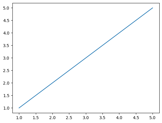
That’s it! It is a very easy / fast way to visualize coordinate pairs along a line.
Chapter 5.1.1 - practice modifying the charts
Problem 5.1.1.1
In the following example, input x and y coordinates that create a flat line.
import numpy as np
import matplotlib.pyplot as plt
x_input = input("Provide a list of 5 numbers along the x-dimension with commas between them")
y_input = input("Provide a list of 5 numbers along the y-dimension with commas between them")
# input is provided as a string. We need to break the string up into parts
# asking the user to provide commas is a convenient way to split up unique values
# feel free to place print statements and probe how the for loops work.
# How would you need to modify the code below if you just asked the users for a space between numbers?
x = []
for x_coord in x_input.split(","):
x.append(x_coord)
y = []
for y_coord in y_input.split(","):
y.append(y_coord)
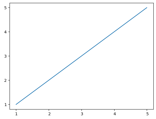
plt.plot(x, y)Provide a list of 5 numbers along the x-dimension with commas between them 1, 2, 3, 4, 5
Provide a list of 5 numbers along the y-dimension with commas between them 1, 2, 3, 4, 5
Problem 5.1.1.2
In the following example, input x and y coordinates that create a vertical line.
import numpy as np
import matplotlib.pyplot as plt

x_input = input("Provide a list of 5 numbers along the x-dimension with commas between them")
y_input = input("Provide a list of 5 numbers along the y-dimension with commas between them")

# input is provided as a string. We need to break the string up into parts
# asking the user to provide commas is a convenient way to split up unique values
# feel free to place print statements and probe how the for loops work.
# How would you need to modify the code below if you just asked the users for a space between numbers?
x = []

for x_coord in x_input.split(","):
    x.append(x_coord)

y = []
for y_coord in y_input.split(","):
    y.append(y_coord)

plt.plot(x, y)
Provide a list of 5 numbers along the x-dimension with commas between them 1, 2, 3, 4, 5
Provide a list of 5 numbers along the y-dimension with commas between them 1, 2, 3, 4, 5
Problem 5.1.1.3
In the following example, input x and y coordinates that create a diagonal line that descends to the right (instead of ascending to the right, like the first example).
import numpy as np
import matplotlib.pyplot as plt

x_input = input("Provide a list of 5 numbers along the x-dimension with commas between them")
y_input = input("Provide a list of 5 numbers along the y-dimension with commas between them")

# input is provided as a string. We need to break the string up into parts
# asking the user to provide commas is a convenient way to split up unique values
# feel free to place print statements and probe how the for loops work.
# How would you need to modify the code below if you just asked the users for a space between numbers?
x = []

for x_coord in x_input.split(","):
    x.append(x_coord)

y = []
for y_coord in y_input.split(","):
    y.append(y_coord)

plt.plot(x, y)
Provide a list of 5 numbers along the x-dimension with commas between them 1, 2, 3, 4, 5
Provide a list of 5 numbers along the y-dimension with commas between them 1, 2, 3, 4, 5
Chapter 5.2 - Customizing your plots
While the default properties provide a nice plot, you can add customization to your plot for your specific needs. While there are hundreds of different ways to modify a plot, we will start with very basic changes. The changes only require you to add a few more parameters to the plt.plot method call. Here are a few basic, but useful, parameters:
Chapter 5.2.1 - Changing the marker size and color
Parameters used:
marker: this can be one of the following (table copied and modified for Jupyter from https://matplotlib .org /stable /api /markers _api .html) but include: .,ov^<>markersize: an integer that increases or decreases the size of the marker at the data pointcolor:
import numpy as np
import matplotlib.pyplot as plt

x = np.array([1, 2, 3, 4, 5])
y = np.array([1, 2, 3, 4, 5])

plt.plot(x, y, marker='.', markersize=5, color='red')

plt.grid()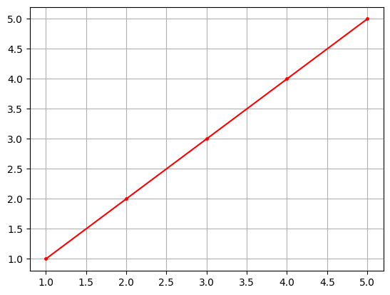
import numpy as np
import matplotlib.pyplot as plt

x = np.array([1, 2, 3, 4, 5])
y = np.array([1, 2, 3, 4, 5])

plt.plot(x, y, marker='.', markersize=50, color='red')

plt.grid()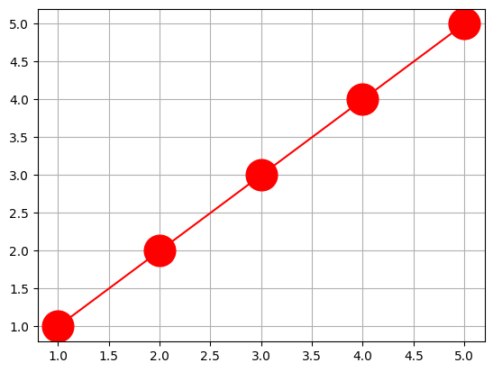
import numpy as np
import matplotlib.pyplot as plt

x = np.array([1, 2, 3, 4, 5])
y = np.array([1, 2, 3, 4, 5])

plt.plot(x, y, marker='>', markersize=10, color='red')

plt.grid()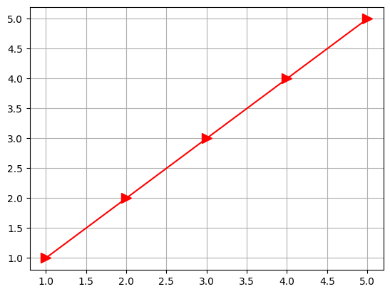
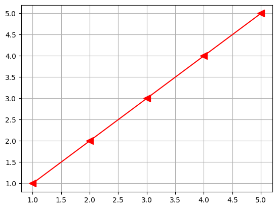
Try modifying the selections below to see how it modifies the plot:
import numpy as np
import matplotlib.pyplot as plt

marker_in = input("marker =")
marker_size_in = int(input("markersize ="))
color_in = input("color =")

x = np.array([1, 2, 3, 4, 5])
y = np.array([1, 2, 3, 4, 5])

plt.plot(x, y, marker=marker_in, markersize=marker_size_in, color=color_in)

plt.grid()
marker = <
markersize = 10
color = red
Chapter 5.2 - Scatterplots
In some cases, it does not make sense to connect the data points together. Instead we can use a scatter to plot unconnected points.
These plots can vary the x and y position of markers, as well as the color of markers. There are some slight differences in the parameter names, so make sure you pay attention to these:
c: equivalent tocolorinplt.plotmarker: equivalent tomarkerinplt.plots: equivalent tomarkersizeinplt.plot
import numpy as np
import matplotlib.pyplot as plt

lon = np.array([-95, -90, -85, -105, -80])
lat = np.array([40, 38, 44, 45, 37])

ef_scale = np.array([0, 3, 1, 2, 5])

plt.scatter(lon, lat, c=ef_scale, marker='v', s=50)

plt.title("Tornado Reports and EF-Scale")

plt.xlabel("Longitude")
plt.ylabel("Latitude")

plt.colorbar()
plt.grid()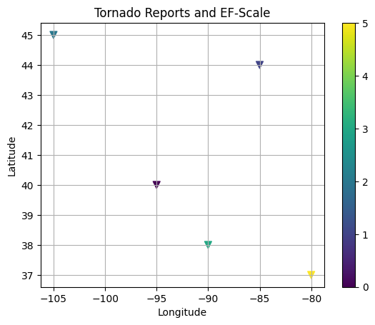
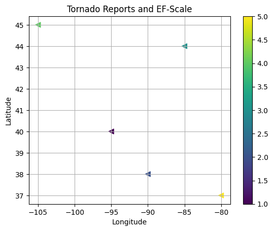
Try to change the scatterplot above by specifying the following parameters:
import numpy as np
import matplotlib.pyplot as plt

marker_in = input("marker =")
marker_size_in = int(input("s ="))
ef_scale_in = input("Provide a list of 5 numbers along the y-dimension with commas between them for parameter c")

ef_scale = []

for x_coord in ef_scale_in.split(","):
    ef_scale.append(int(x_coord))

lon = np.array([-95, -90, -85, -105, -80])
lat = np.array([40, 38, 44, 45, 37])

plt.scatter(lon, lat, c=ef_scale, marker=marker_in, s=marker_size_in)

plt.title("Tornado Reports and EF-Scale")

plt.xlabel("Longitude")
plt.ylabel("Latitude")

plt.colorbar()
plt.grid()
marker = <
s = 50
Provide a list of 5 numbers along the y-dimension with commas between them for parameter c 1, 2, 3, 4, 5
Chapter 5.2.1
Look up your favorite tornado outbreak or earthquake event. Find the latitude and longitude values for the event, as well as the magnitude.
Create a scatterplot to show the locations of the events and include varying colors to show the magnitude of the event.